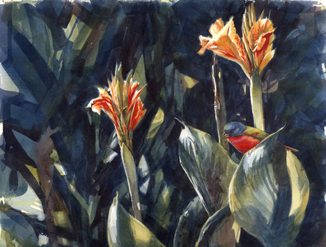
Just finished two versions of the Painted bunting Bird Watcher’s Digest cover I’ve been working on this week, and have the third in the series well along. I’m pretty taken with the Canna Bunting version, though, gotta warn you. I hate to say how many times I’ve had to do this bird over, especially the face, which is so sweet in the real bird.
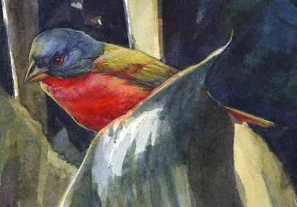
Getting to blazing hot red, royal blinding blue and vicious lime green in watercolor ain’t easy. You can’t get there straight out of the tube, at least I wasn’t capable of it, and I had to patch a lot of colors together to imply what I wanted. So I’ve been doing a lot of rewetting and lifting pigment, scrubbing the paper and even going over areas with goache (pronounced gwash) which is an opaque watercolor. I hate to resort to opaques but business is business. And I was not only trying to get a blazing hot red, but was trying to show the shape and volume of the bird. Pain in the butt, it was. I think it might have been easier and maybe more successful executed in acrylic paint, or possibly tiny bits of broken lapis lazuli, ground sulfur mixed with jade dust, and a soupçon of cochineal beetle juice with a dash of tabasco.
Recipe for a nice hot watercolor red:
Step one: Quinacridone Gold wash, let dry completely
Step two: Opera Pink (wow, what a color- bubblegum on steroids!) washed over QG, let dry
Step three: Rose Madder, use judiciously over both and be sure that the previous layers show .
Step four: small touches of Linden green goache, and goache tints of Cobalt blue and opera pink for further touches.
Step five: Cadmium red medium, Alizarin Crimson, Winsor Red, any damn thing that looks red.
Step six: Panic and scrub everything off with a stiff brush, dab paper dry and start over.
Oh well, whatever works. Experiment on a scrap of paper, for sure.
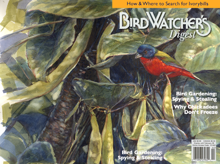
I keep a layout template for Bird Watcher’s Digest in a folder on my Mac and use it in Photoshop to check my composition and layout. It’s handy and lets me preview and crop at will. BWD uses a wrap-around cover, with the art extending front and back. Here are the two versions popped into the layout template:
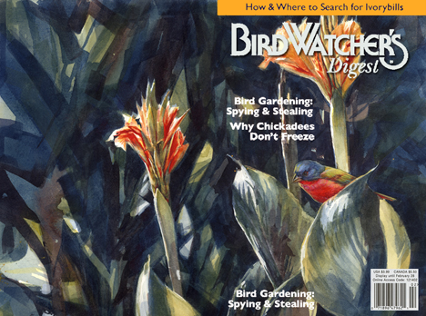

I love both versions, but am leaning toward the Canna version also. And pray tell, where DO you find cochineal beetle juice in large enough quantities to fill a soupçon?
Check Sam’s Club for cochineal beetle juice in soupçon size. They keep it in the dairy case with the crushed sulfur and jade dust.
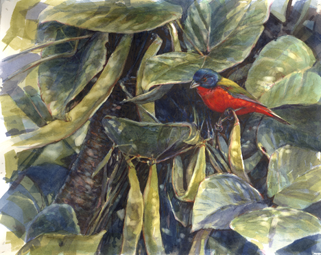
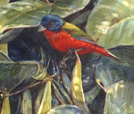
I like the bean version best, but it is because the bird looks so out of place. Also, I have seen beans, though not of the kind that you painted, but I have never seen that other plant. I can remember the bird in the beans, but cannot remember the other one, because also I can’t get colour.
AND in the upper template the bird is one of the three red spots. It has become part of the decoration. Whereas in the other cover it looks like it is not quite part of the show.
Well,let bird two look placid. It’s true bird one looks ready to jump. But the whole bean picture is so good, so memorable. And you’re right–the filtered light effect comes off perfectly. I can’t wait to see your third idea.
I really like the canna version for the cover of BWD.
The canna version is packed and ready to ship off tomorrow; it was my favorite, too. The third version (daylily) started off wonderfully and then tanked: as usual, I seemed to be unable to restrain myself from shoveling on the watercolor with a trowel, losing the path to the paper that Julie keeps in all her work- she makes it look effortless (I know it isn’t, but she gives us that illusion), so fresh and glowing, and her birds are awesome and right on the money. Can’t wait until I can put watercolor onto paper that well-I’m trying, I’m trying!
I’m a fool for the cannas. That one that will be on the back cover is to die for. I also like the bird in the canna version, very much. Love your recipe for getting red!!
I’m askeert of reds, too, but I almost never put more than two washes on red, because it soo loves to go dull on you. And Winsor Red is so sneaky, the way it goes on bright and dries dull pink. Phew. I underpaint with a light, clear yellow too. If it’s any comfort the red of a painted bunting is just flat out tomatoey weird.
Cannot wait to see this on the cover! Your template in Photoshop makes my template on tracing paper look so backerds.
Thanks so much for the kind words. But if I have any prowess in watercolor at all, it’s thanks to never dipping my toe in any other medium. I know when I’m beat.
Bravo on what will be our most exciting cover of 2008, I’m sure.